🚀 Task Manager
This Task Manager template is an easy-to-use, flexible and centralised solution to manage and kee...
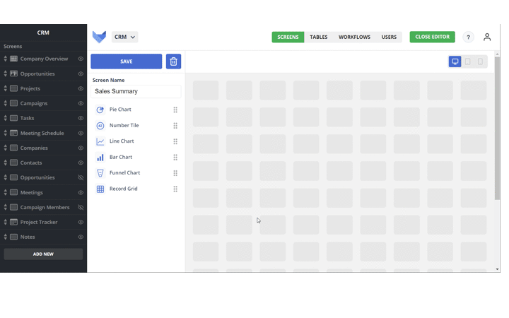
🚀 Sales CRM
This Sales Tracker template is ideal for all teams and sizes. Whether you're managing a handful o...
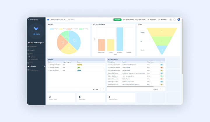
🚀 Project Manager
The Project Manager is the perfect template for tracking your projects and tasks. With the abili...
Applicant Tracker
This Applicant Tracker template provides a simple way to track any open job roles, whether you’re...
Campaign Manager
Perfect for start-ups and independent consultants, through to large-scale agencies and in-house m...
Holiday Planner
Gain complete visibility of days off across your teams with this simple Holiday Planner template....
New Starters
Streamline and simplify your new employee's onboarding process with this New Starters template. W...
Project Planner
Perfect for start-ups and freelancers, through to large-scale enterprises managing hundreds of pr...
Stock Control
This Stock Control template is perfect for tracking all of your product orders and sales. Whether...
Webinar Management
This Webinar Management template provides a simple solution to effectively plan and manage all of...
Asana vs Gridfox
Asana is great for simple to-do lists, but complex projects demand more. Gridfox goes beyond task...
ClickUp vs Gridfox
ClickUp tries to be the one app to replace them all, but its endless features can create clutter ...
monday.com vs Gridfox
monday.com is fantastic for visualizing workflows, but complex work demands more than just boards...